Coderwatch: Episode 2 – Design with Figma and Procreate

Here is the second post of this serie around the creation of a side project.
If you haven't read the first one, my goal is to make a mini series retracing all the steps for creating a relatively basic application:
www.coderwatch.io
whose main pitch is_: learn computer languages and frameworks while playing . I suggest you take quizzes, earn points, and gradually climb the leaderboard against other players while improving your knowledge._
This is an opportunity to learn more about different web professions: designer, PM, back dev, front dev etc… Because yes, the challenge is to touch on all the professions.
And precisely on this post, we are going to talk about UI, UX and illustration, which is very far from my comfort zone and it is probably also far from the audience that usually reads this blog. But precisely, it may open up new horizons for you.
Other post in this serie:
- This is the story of a side project : cultivating an idea, creating an MVP
- Coderwatch: Episode 2: Design with Figma and Procreate
- Integration and web development with Bulma, Vue.js etc… – Coderwatch episode 3
First step, the wireframe
Before coding, the ideal is to do several tests on a design. It's probably something I did less a few years ago as I had a certain tendency to start developing with a very simple frontend. But I admit that having a good wireframe, starting to represent a user journey, illustrating transitions, is a first step that has many advantages:
- it's much faster to iterate over a design than over code
- corollary: we can quickly create user journeys
- we can very easily show a “finished” product and collect critical opinions
- it's super satisfying to have a model finished at the end of a first iteration rather than ugly pages with ¼ of the features we have in mind (the wireframe can be much more complete)
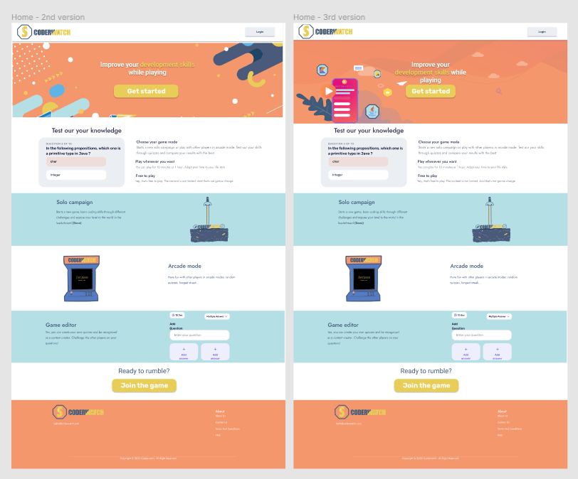
Example here with two different versions of Home.
Find a theme on themeforest
My challenge is to do everything from floor to ceiling. But that doesn't prevent me from looking for inspiration elsewhere.
So for that I used themeforest which allows to acquire graphic themes in different format.
We often know this site for wordpress themes but we can also find Figma designs there . So I looked for themes to use as a moodboard and I selected two for a total cost of 49 dollars.
My favourite: Figma
I just talked about Figma without explaining what it is. It is for me one of the best current tools for making web designs. It is quite easy to handle, including for a neophyte like me.
I'm not a Web designer or Product Designer, I probably used it at less than 10/20% of these capacities but it's enough for my goals.
Small panel of features that I managed to use:
- create reusable styles (especially for fonts and colors)
- component creation (button, badges, list items)
- vector drawing and export to SVG
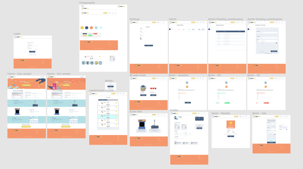
In short, I was able to start from themes purchased on themeforest, create reference components, introduce a color palette that I chose, add illustrations and in the end, customize everything for my own use.
In the end, it represents about twenty pages of which here is a small overview:
Illustrations: Procreate
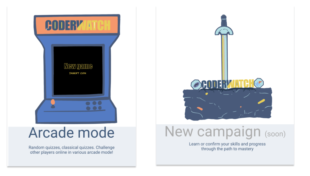
For a game, I wanted to introduce graphic elements and I wanted to get closer to a retro gaming spirit. For that, I found that Flat design was well suited and I wanted to do my own illustrations.
What I used here is clearly not the right tool. In theory, to do vector graphics, I could have stayed in Figma or used tools created for that (adobe Illustrator, Inkscape etc…).
However I was not very comfortable with vector drawing while I felt rather confident with Procreate which I already use to draw .
So I used Procreate for all the illustrations of the site, the logo, the badges found in Coderwatch.
On the other hand, these are images, not svgs and we totally lose the expected advantage over a vector drawing which must support several image sizes without degrading the quality. The size of the images above is much too large (around 400kb per image).
Oh yes, and in the future I would love to use Lottie to add animations at key moments in a game. But hey, I set myself a maximum time on it and I preferred to move on.
Conclusion
In the end, this modeling phase lasted about a week with the research of themes, color palette, component creations in Figma, assembly, UX research and illustrations.
A professional would probably have been faster. Or maybe it would have taken the same time but the result would have been much better:
- The Figma would be cleaner, it would use grid systems, better management of components or lists, transitions
- the UI would certainly be prettier, more coherent, better contrasted
- the images would be more optimized
But for a first version at 49 dollars, I would settle for it.
In any case, it's a pretty fun step to do, and very satisfying because it allows you to quickly visualize the direction you want to go. It is also a very good medium for getting the first feedback.
And of course if you want to invest a little more money, you can easily contact a freelancer in Web Design, illustration, UI/UX on Malt directly . I'm maybe wrong but I would say that for my case with about twenty pages, a design system to create, some illustrations it would have taken between 3000 and 10000 euros approximately?
(I didn't have checked this number with a freelancer so if I say something stupid, tell me in the comments and I'll fix it)
In the next post, we will talk about the HTML/CSS/JS integration phase.
See you soon.